I ♥ My NetSuite Dashboard
Happy Valentine’s Day!
As you are all exchanging roses and cards, telling each other how much they are loved, I wanted to pay homage to the love of my (business) life. My NetSuite system.
I love my NetSuite dashboard. However, I try to stay away from overly “salesy” blogs because I know no one wants to read that kind of stuff but when I found myself commenting the other day, “I bloody love my NetSuite dashboard”, my colleague suggested I blog the reasons why. So I thought I would (if only because if I was just a normal NetSuite user rather than a NetSuite sales person, I would still write this blog).
How do I Love Thee? Let me Count the ways
1. I can see all the information I need to see via the medium of pretty pictures
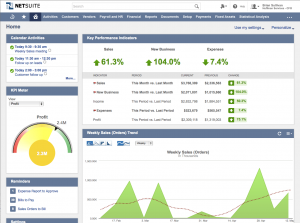
Graphs on my dashboard include but are not limited to – Monthly New Opportunities, Pipeline Status Summary and Open Opportunities. At the click of a mouse, I change the graph format so it’s easier to interpret or to analyse. The opportunities one looks like a car dashboard gauge. This is appropriate because when I’m “in the red” I feel the same level of panic as when my petrol gauge lights up. Where’s the nearest opportunity? I need to fill up! Where can I get new leads?!
2. It motivates me
I have a KPI scorecard which measures my weekly activity on an ongoing basis. I have decided my business metrics should be:
- BANT Scored
- Needs Analysis Completed
- Product Demonstration Delivered
- Proposal Offered
- Phonecalls Made
My scorecard builds up a picture of my week by week activity over a two month time frame. Even though I am only competing with myself, it still drives me to make more calls, arrange more fact finds and push out more proposals – if only to see more green arrows pointing up than red arrows pointing down!
3. I can click straight through to all my open opportunities
This sounds like a simple one but believe me it’s not. I used to work with a bespoke CRM system which only allowed me to run a search for phone calls within a specific time frame. It didn’t help me understand whether these calls were to be made to companies who were leads, prospects or opportunities. I had to remember that level of detail or drill down into the notes before each call. When it became too much to remember, I had to keep a spreadsheet of all open opportunities and cross reference that with CRM my call list each day. Imagine how time consuming that became. The margin for error was huge. Crazy!
4. I can make it look different if I want to
Every little “portlet” is a drag and drop box, so if I want to change the view I see every day, I simply move it around. If I want to focus on a particular area of my performance I can drag that metric to the top of my screen; so I am constantly reminding myself of it each time I return to my dashboard.
[Click here to watch my video on adding a portlet to your NetSuite dashboard]
Want a new graph which shows me Profitability Per Client? No problem, I can create that myself within 2 minutes. I can also drill down into each metric to find the data which sits beneath it. Click, click – analysis complete!
To talk to someone about NetSuite, get in touch.